CASE STUDY — RE-DESIGN TO RE-LAUNCH · 2021 - 2022 · MULTI-TENANT ENTERPRISE SAAS
Redesigning legacy IT service management platform — recognised 4 times by Gartner, delivering 20% operational savings for global enterprises

Confidential — some details have been omitted to comply with my NDA.
4x
Gartner Choice
20%
Ops Saving
Global
Enterprises
My Role
Senior Product Designer
Year
2021
Industry
ITSM SaaS
Team & collaboration
01
Senior Product Designer
Solo designer. End-to-end design ownership — discovery workshops, user research, information architecture, wireframing, usability testing, visual language, and high-fidelity UI across six modules.
Scope of Work
01
Legacy Product Redesign
Took an outdated, debt-heavy ITSM platform and redesigned it end-to-end — information architecture, interaction patterns, and visual design across six modules and 350+ screens.
02
Research & Strategy
Ran 10+ discovery workshops with stakeholders and 8 user interviews across three user roles. Synthesised findings into pain points, HMW questions, and a clear set of redesign priorities.
03
Wireframing & Usability Testing
Designed greyscale wireframes for every feature and tested with 10 participants. Iterated on interaction patterns and data presentation until each module was validated before moving to visual design.
04
Visual Language & Design System
Defined the complete visual system — colour, typography, iconography, spacing, and component states. Ensured WCAG AA compliance across all UI elements before high-fidelity execution.
04
UI Design & Visual Concepts
Designed two distinct visual concept directions and presented both to the client for sign-off. Delivered finished high-fidelity UI across six modules and 350+ screens.
Overview
Goal
"Redesign a legacy multi-tenant IT service management platform end-to-end — replacing an outdated interface with a modern, accessible product that reduced analyst workload, improved SLA compliance, and met the usability expectations of global enterprise clients."
Background
SummitAI is a multi-tenant ITSM SaaS platform used by enterprise organisations to manage IT incidents, service requests, change records, problems, and knowledge — across departments including IT, HR, Finance, and Operations. The platform serves analysts, technicians, and administrators who work inside it for hours every day under strict SLA pressure.
The problem
Customer satisfaction across the platform's five core modules had been declining. The legacy interface had been patched and extended over years without anyone stepping back to rethink the experience. — information scattered across tabs, complex navigation for routine tasks, no visual hierarchy, and a design language that hadn't kept pace with modern enterprise software. Analysts were losing time to the interface itself, not just the work.
My role
I was the sole designer on this project. I owned the entire redesign from discovery to delivery — running stakeholder workshops and user interviews, defining the information architecture, designing wireframes and usability testing them, building the visual language, and and delivering finished UI across six modules and 350+ screens.
The Challenge
Industry context
ITSM platforms are among the most complex enterprise software products to design for. Analysts work under constant SLA pressure — every minute spent navigating a poor interface is a minute taken away from resolving a real incident. The users aren't occasional visitors; they're power users who live inside the product all day. That raises the standard considerably — not just for how the product looks, but for how fast it lets someone work.
The design challenge
The legacy SummitAI interface had been built incrementally over years — each module added functionality without ever stepping back to rethink the overall experience. The result was a product where related information was split across tabs, filtering required multiple steps, and nothing visually connecting one module to the next.
The redesign wasn't just a visual refresh. It required rethinking how analysts navigate between modules, how they triage and act on incidents under time pressure, and how the interface communicates priority, status, and SLA health at a glance — across a multi-tenant platform serving clients in completely different industries.
Core constraints
01 Multi-tenant complexity
Every design decision had to work across multiple client organisations simultaneously — different departments, different workflows, different data configurations — without custom builds per tenant.
02 Six modules, one designer, six months
The scope covered Incidents, Service Requests, Change, Problem, Knowledge, and Dashboard. Full end-to-end across all six, with no other designer on the project.
03 Enterprise usability standards
The client had existing Gartner recognition to protect. Everything — how filtering worked, how data was laid out, how forms behaved — had to meet the standard of best-in-class enterprise software, not just be better than the legacy product.
The legacy SummitAI interface — dense data layout, no visual hierarchy, and navigation that required multiple steps for routine analyst tasks.
Research
Discovery workshops & interviews
I ran 10+ discovery workshops with the client's product team and stakeholders across all five modules — mapping existing workflows, documenting where analysts were losing time, and identifying which problems were worth solving first.
Following the workshops, I conducted 8 semi-structured remote user interviews with participants across three user roles — end users who raised incidents, analysts who triaged and resolved them, and administrators who managed platform configuration.

User research synthesis — what participants stated, observations and inferences, and problem statements mapped per interview.
Key findings
Every interview came back with the same frustrations.
"It's hard to respond to all the tickets being logged when there's a widespread outage — the volume just piles up and there's no way to triage fast enough."
— Technician, Enterprise IT
"The process of resolving an incident is tedious and time consuming — the form requires filling up multiple fields before I can even assign it."
— Analyst, Enterprise IT
Four key insights
Insight 1: Analysts need to triage at a glance
Every analyst interviewed described spending time opening individual incidents just to understand priority and status. The list view gave them no way to scan — everything looked equally important.
Insight 2: Filtering was a daily frustration
High-volume queues with no quick filtering meant analysts scrolled through irrelevant incidents to find what needed attention. Multi-condition filtering was possible in the legacy product but took too many steps to use routinely.
Insight 3: Context switching broke the workflow
Related information — caller details, SLA status, assignment history, communication thread — was split across tabs. Analysts had to navigate away from the main incident view repeatedly to get basic context for resolution.
Insight 4: Multi-tenant data management had no guardrails
Administrators managing multiple client tenants had no structured way to enforce data privacy boundaries. Configuration was manual, error-prone, and not reflected visually in the interface.
Design Decisions
Key design decisions
Decision 1: Card and list toggle for the incident queue
Why
Analysts work differently depending on their load and context. During high-volume periods they need density — as many incidents visible as possible. During triage they need visual scanning — priority, status, and SLA at a glance without opening each record. A single fixed layout forced a compromise that served neither use case well.
What we built
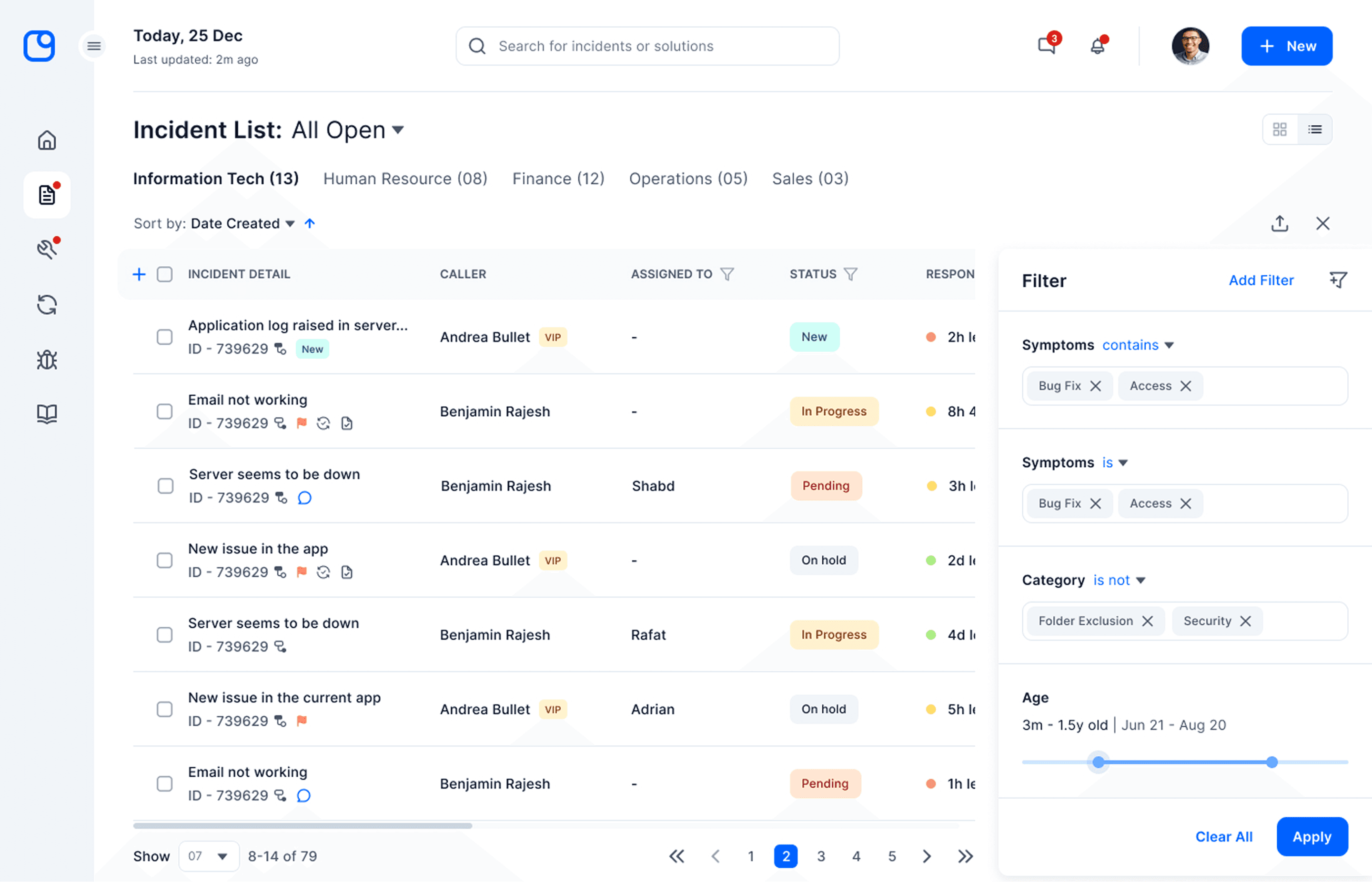
Two views for the incident queue — a card grid for visual triage and a compact list for high-volume scanning. Both accessible from a single toggle in the list header. Department tabs let analysts narrow the queue to their area without touching the filters at all.

Card view — priority, status badge, SLA countdown, and assignee visible per incident without opening the record.
Decision 2: Inline filter panel with advanced modal for power users
Why
Filtering was one of the most cited pain points in user interviews. The legacy product buried filters behind multiple steps — analysts either didn't use them or wasted time setting them up. At the same time, some analysts needed to filter by multiple conditions at once — the kind of power filtering a simple bar can't handle.
What we built
A side panel that slides in without leaving the list for quick filters — symptom, category, age range with a slider. For complex multi-condition filtering, an Advanced Filters modal handled field, condition, and value combinations with AND logic. Two levels of filtering for two different analyst needs.
Light theme with colour-coded activity cards — high contrast for dense scheduling workflows.
Decision 3: Single-page incident detail with live timeline
Why
The legacy incident detail spread related information across seven tabs — general, communication, checklist, relationship, troubleshooting, vendor information, additional information. Analysts navigating between tabs to get basic context were losing time on every single incident they touched.
What we built
A three-column single-page layout — incident description and metadata on the left, caller and assignment details in the centre, and a live timeline on the right showing every action taken on the incident in sequence. Everything an analyst needed to understand, act on, and resolve an incident without leaving the page.

Single-page incident detail — description, caller details, assignment, SLA, and full action timeline in one view.
Decision 4: Design system-first approach
Why
Widespread outages generate dozens of separate incidents from different users simultaneously. Analysts needed a way to link all related incidents to a single parent record — but the legacy product had no efficient bulk workflow for this. Analysts were linking incidents one by one, a significant time cost during exactly the moments when speed mattered most.
What we built
A bulk linking flow — select multiple incidents from the list, search for or select a parent record, preview the full parent details before confirming the link. The preview panel meant analysts could verify the right parent without opening a separate tab. The footer confirmed the action with the parent ID visible before committing.

Bulk incident linking — 22 incidents selected, parent preview on the right, confirm before committing.
Outcome
What we shipped
A fully redesigned ITSM platform across six modules — Incidents, Service Requests, Change, Problem, Knowledge, and Dashboard. 350+ screens delivered, WCAG AA compliant.
Business impact
Global Enterprises
Financial services, healthcare, manufacturing, and education — SummitAI's redesigned platform was adopted across large global enterprises in industries where IT service availability directly impacts daily business operations.
4x Gartner choice
SummitAI was recognised four times by Gartner Peer Insights as a Customers' Choice for IT Service Management Tools.
20% Ops saving
Operational efficiency improvement across analyst workflows, measured through reduced average resolution time and decreased SLA breach rates post-launch.
Key product capabilities

Summary dashboard — SLA health, incident volume, service breaches, and updates across all departments in a single view.

Knowledge base — article cards with usefulness signals (Found Useful, Tried & Failed, Not Very Clear) to help analysts assess KB quality before opening.

Change calendar — colour-coded month view with department filtering and change request search, replacing a flat unstructured table.
Reflection
Learning 1: Prioritisation is a design skill
Six modules, six months, one designer. Early on I tried to give every module equal attention and it didn't work — some features got less rigour than they deserved. I should have been more deliberate upfront about which modules carried the most analyst time and protected that design time accordingly.
Learning 2: The research does the heavy lifting
The before/after on the incident detail page looks like a visual transformation. What's harder to see is that every layout decision — the three columns, the timeline, the single-page structure — came directly from what analysts told us in interviews. Next time I'd make that connection explicit in the documentation — showing not just what was designed, but why each decision came directly from what users said.
Learning 3: Build the design system before you need it
350+ screens across six modules held together because I built the design system maintained and grown it side-by-side. On a project at this scale, the design system isn't a option — it's the only thing that keeps the work coherent throughout.
Explore how I designed performance monitoring and compliance reporting app for Mediterranean Shipping Company (MSC) — 650+ vessels, compliance reporting cut from 7 days to 2
Read next case study